
When investors get attracted to one industry, the move can be relentlessly good. Over the years, we have seen semiconductors, software, IT security, cloud, payment systems, or EV’s all go on significant runs to name a few examples.
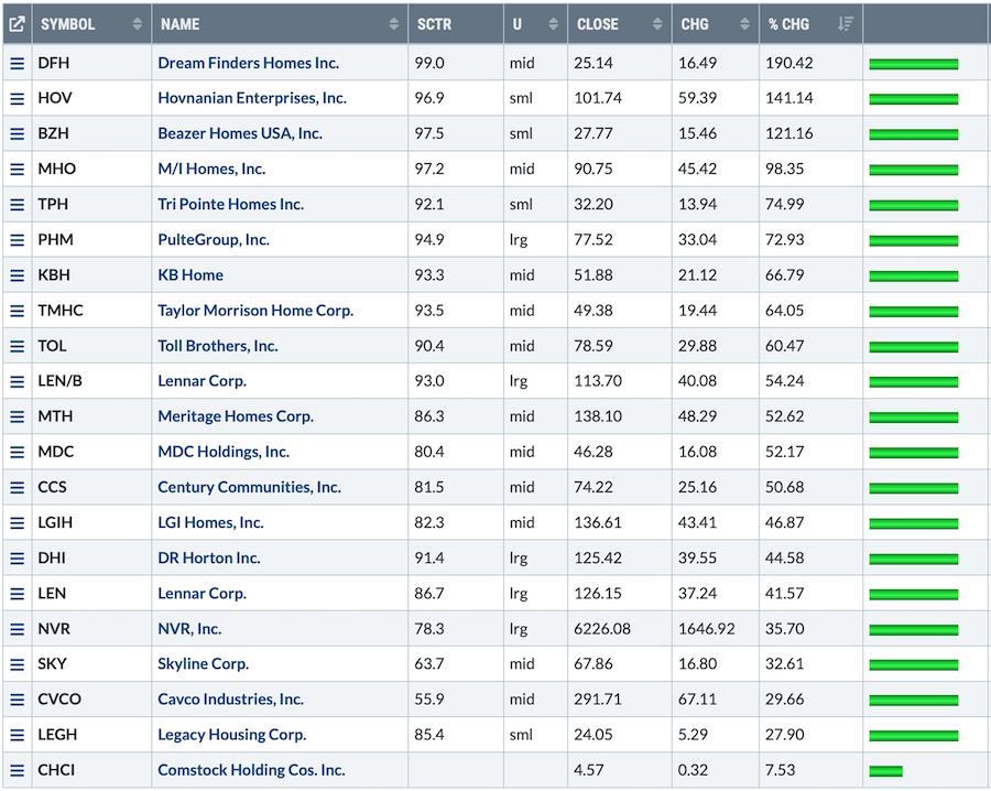
I doubted home builders as the mortgage rates continued to climb. The reality is the demand for these shares has been insatiable. This table is the year-to-date move in the home builders. Remarkable! Check out the % change column!
Below, I have assembled charts of some of the homebuilders.
The SCTR (StockCharts Technical Ranking) proprietary StockCharts indicator can make outperformance really clear. I think it is worth commenting on how helpful this can be.
The SCTR ranking on every one of these home builder stocks has been pinned at the top. I like to draw a line on the SCTR at 75%. My logic for that line is that when stocks are above it, they are in the top quartile of positive price action compared to their peers.
Eventually the group will break down. How will we know? Eventually, they will no longer outperform. One of the longest periods of outperformance shown by the SCTR was on Tesla at 15 months as an example. It is rare air when a stock holds up for more than three quarters.
On each chart, I’d like to highlight a few reasons to look at the SCTR, as well as other indicators.
1) The SCTR will drift below 75, but it is usually a late indicator for showing when the run in the stock is over. When the group starts to underperform that is a very good clue that the stocks could start to perform in line with the $SPX, but more likely falls to underperformance. Eventually momentum investors will sell the average performance and move to stronger stocks. This change of ownership can create weakness in the chart.
2) My purple area chart shows the relative strength (RS) compared to the $SPX. When a run is over, this indicator will start to break trend first. The trend line break is a clue that the outperformance is changing. As the indicator starts to break to three month lows, it is more of a concern.As this happens, I like to have a strategy for taking profits. If all the stocks start to break the $SPX RS trend, it is worth trying to figure out if any of the big winners should continue to be held. The goal is to get out near the top, not round trip the gains by stubbornly holding on.
3) The moving averages are currently under the price action on all these charts. Eventually the prices will start to drift below the moving averages. This is a more traditional approach of looking for price weakness.
4) The PPO on the daily chart will start to spend time below zero. I haven’t put the weekly charts in this article, but when the weekly PPO’s start to drift below zero, it’s a better clue that the miraculous run is ending.
I’ve posted the charts with little commentary and let the trends on the charts speak for themselves. The stocks all pulled back this week but is this the end of the run? All the charts are holding above important trend lines and bull market characteristics but a few are starting to test some of the trend lines.
One of the home builder CEO’s sold $50 Million in stock in July. Do they see something we don’t see yet? My suggestion would be to watch what investors do. It will be subtle but it will eventually happen. I definitely don’t want to waiting for earnings to slow. The stock will be off 50% by then.
These indicators help me keep the majority of my profits when trends change. I hope you’ll find some of these clues helpful. If you click on the charts, you can see all the settings I use. If you come back to this article in a few weeks or months, you’ll be able to see how the trend changes near the end.
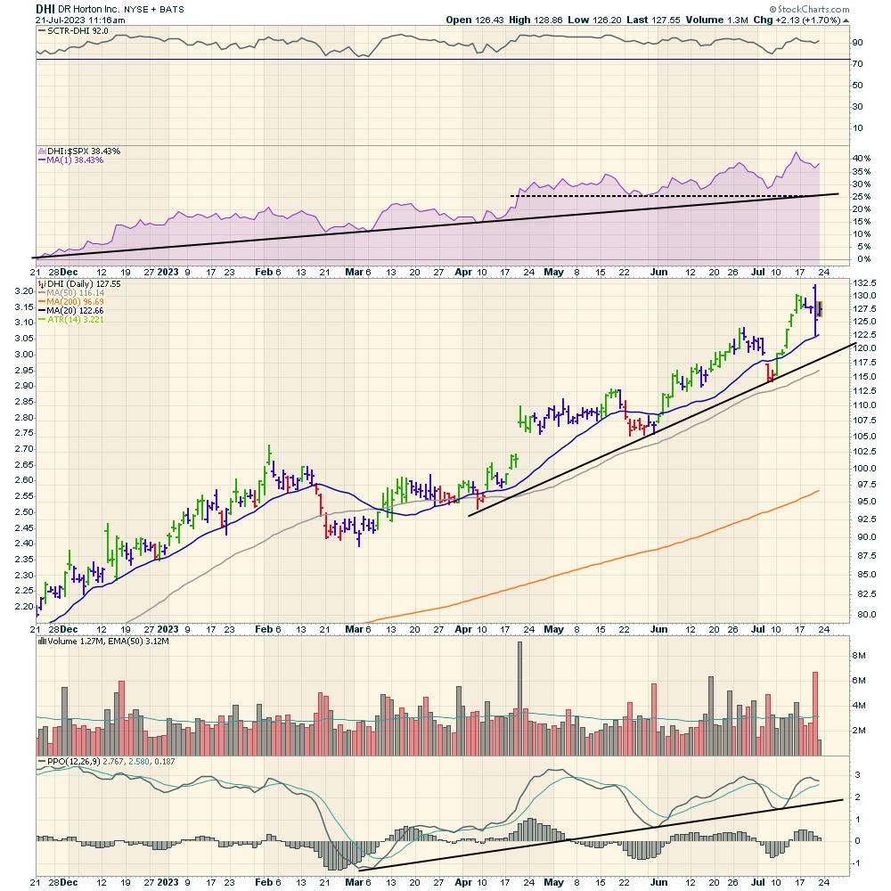
DR Horton
DHI
Beautiful uptrend from bottom left to top right. Still holding the up trend.
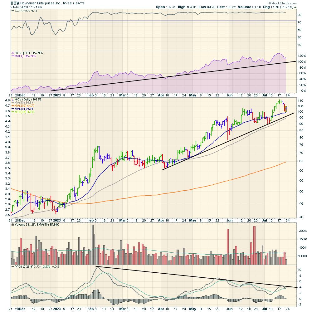
Hovnanian
HOV
Long trend still holding.
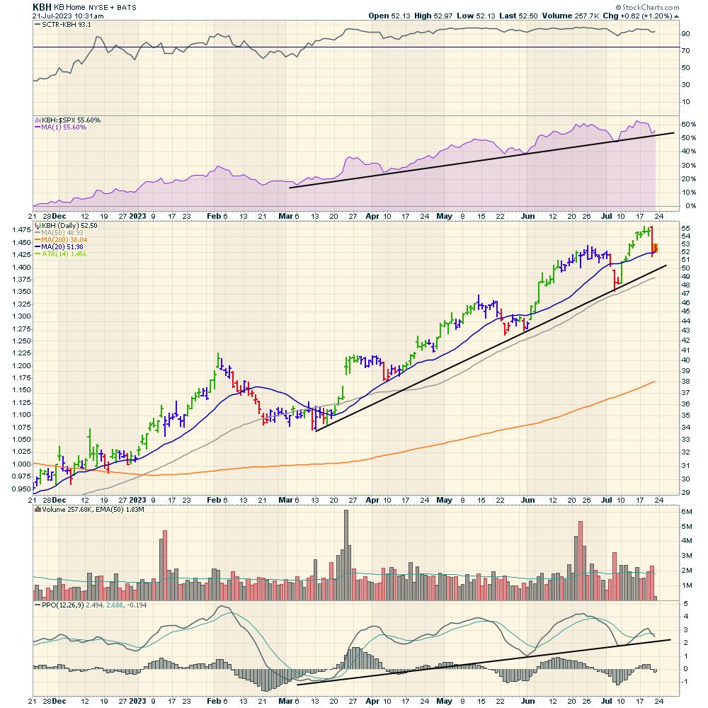
KB Homes
KBH
Long trend is still intact.
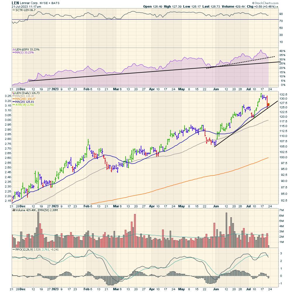
Lennar
LEN
Lennar is still holding the long trend.
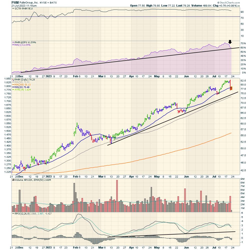
Pulte Group
PHM
Long term trend is still intact.
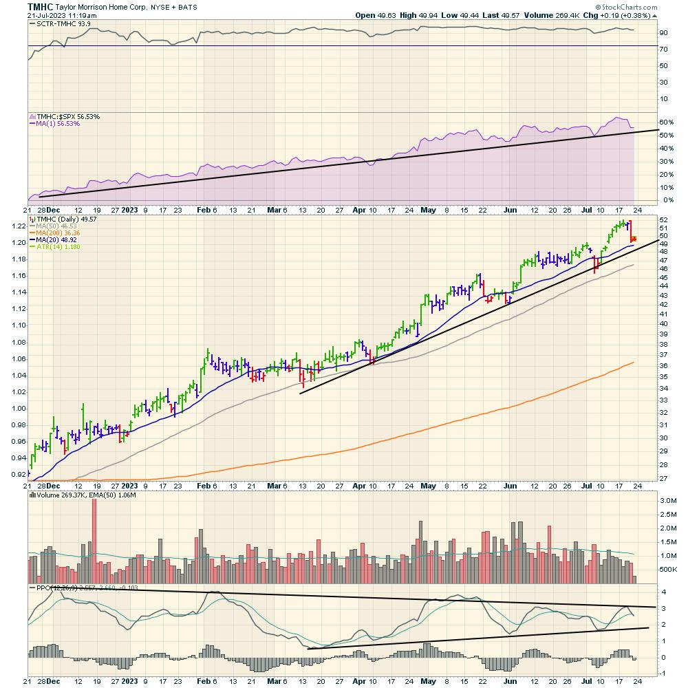
Taylor Morrison Home Corp
TMHC
Beautiful long trend. The PPO is making lower highs on every rally so losing some of the momentum.
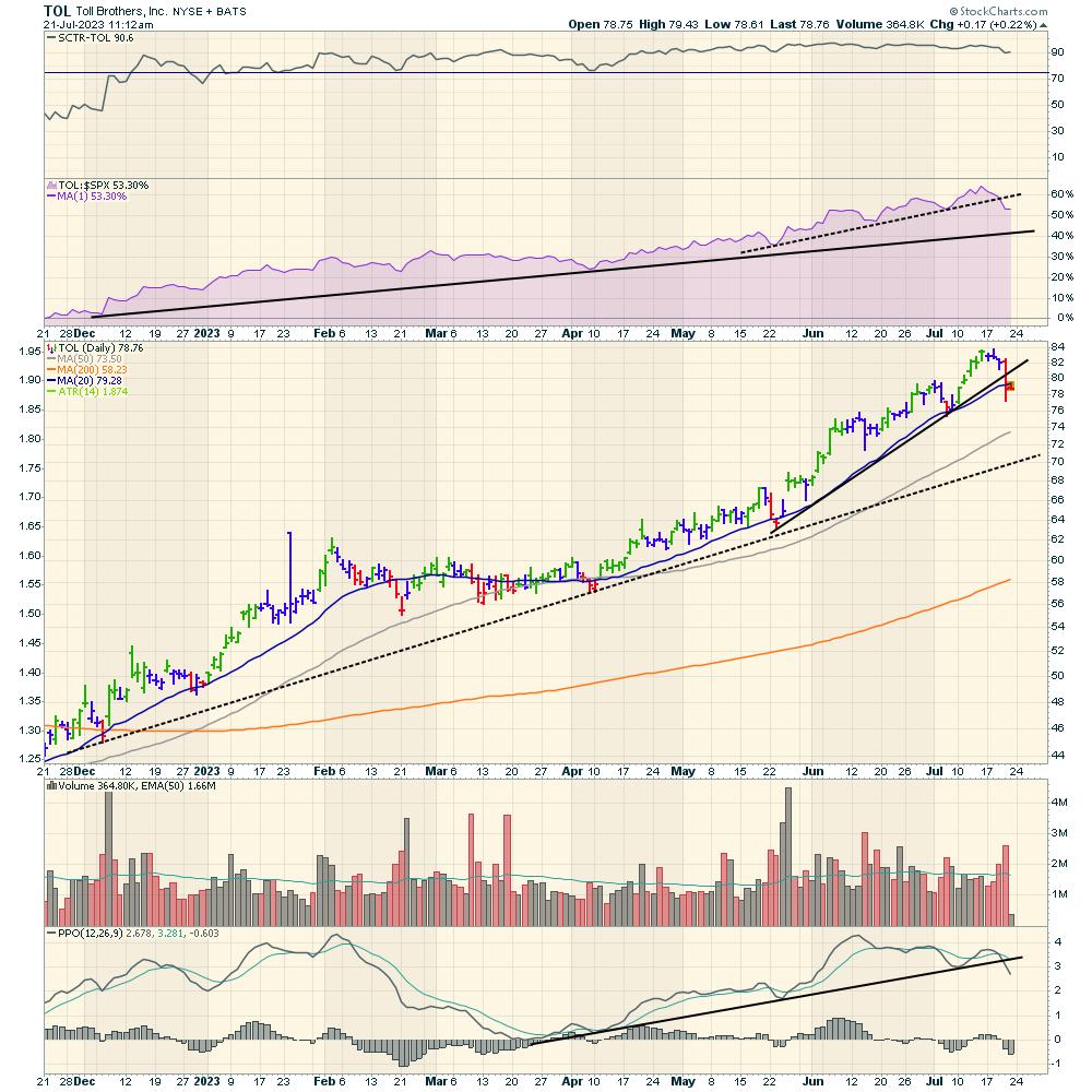
Toll Brothers
TOL
Short term trends breaking but longer term trend is still intact.
You can click on these charts in a few weeks and see if conditions are changing.
One of the reasons we focus on the performance within an industry group is to help us see changes in market rotation. Within the Osprey Opportunities section of the Osprey Strategic website, we post charts within different themes to help our clients find excellent setups.
In the book StockCharts for Dummies, I focused on different methods to see relative strength. You might like this as a resource book that explains relative strength.
Below is a sample picture of the Osprey Opportunities page for our members. Each image links you into a chartlist of stocks with nice setups based on a theme or industry group.

If you like the work we do, I’d welcome the opportunity to show you what our members see. You can try out our offering at Osprey Strategic for just $7. We do broad market analysis, macro themes, individual industries, currencies, commodities, bonds, equities and a small but informative amount on Crypto.
Have a great weekend!