
As a trend follower, I’m bullish. I can’t deny that the trend is positive on all three time frames using my Market Trend Model. So any bear case at this point has to be based on a market being so overextended that it is ripe for a pullback.
And that’s exactly where I see things in June 2023.
Mega cap technology names like AAPL, MSFT, and NVDA have been at the epicenter of the AI boom that has dominated market psychology in recent months. No longer are we valuing companies based on an actual demonstrated ability to turn a profit, but rather on a promise of incredible future profits that are most certainly coming later.
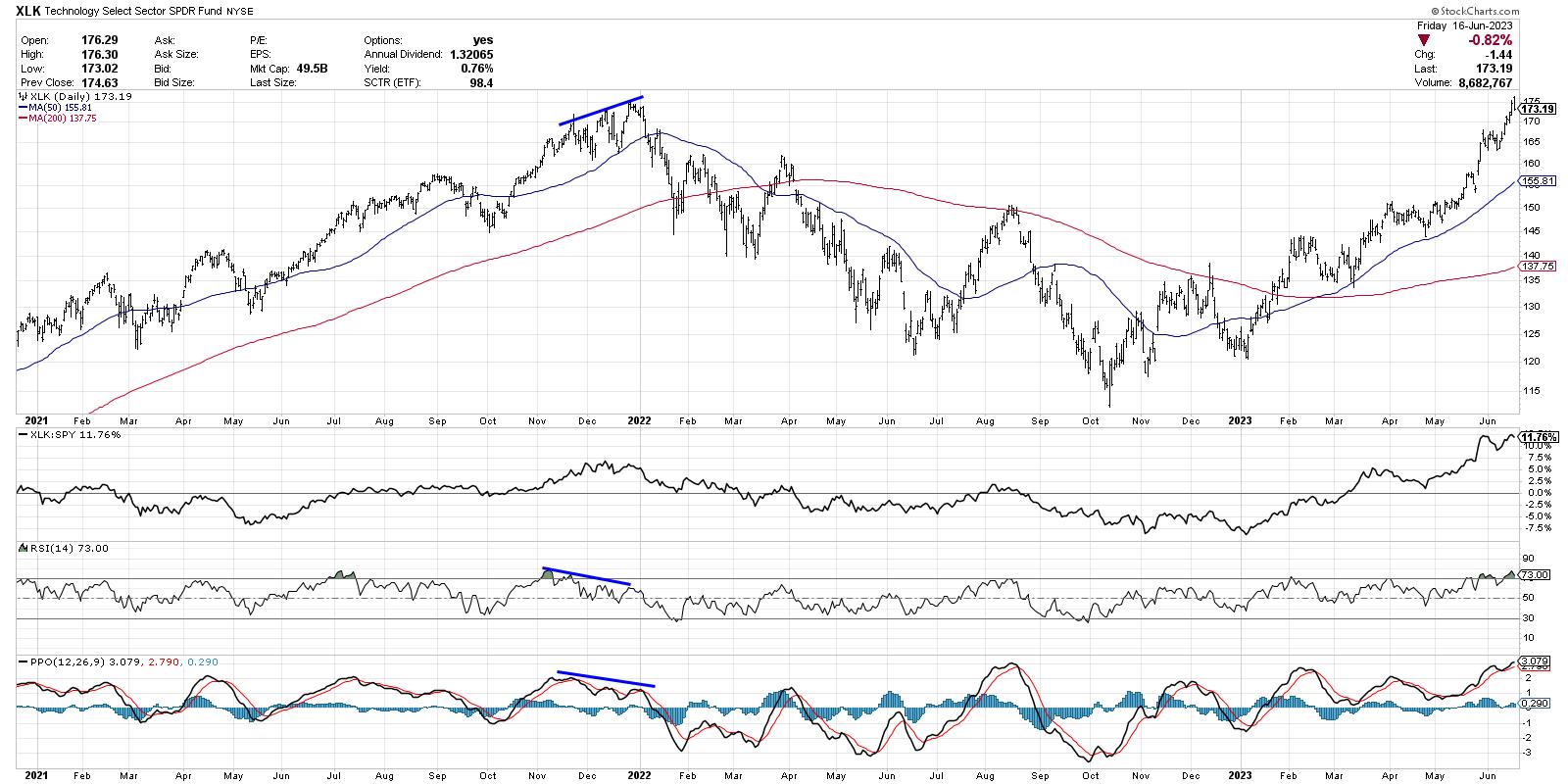
Let’s be clear, the trend remains positive for now, with charts like the XLK testing all-time highs. But is there enough momentum to power charts like this not just to resistance, but through resistance?
The technology sector is currently overbought, with an RSI that has been over 70 for much of the last two weeks. This is a sign of a strong chart that is getting stronger.
Now compare the current readings to the end of 2021, and you’ll see what a real top looks like. Instead of the RSI pushing higher, it starts to slope lower at the end of a bull phase. This creates the infamous bearish momentum divergence, where price and momentum diverge, indicating a lack of bullish support for the trend.
So, until we see a bearish momentum divergence on the XLK chart, any pullback would feel more like a short-term pullback within an uptrend, as opposed to a major market top.
Now let’s consider the breadth situation.
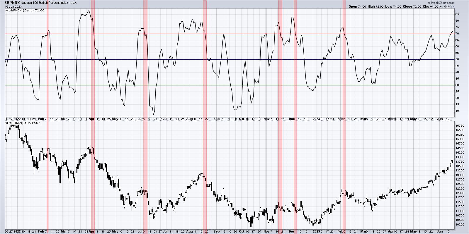
The Bullish Percent Index for the Nasdaq 100 measures breadth by reviewing each point & figure chart of the 100 NDX members. Is the most recent point & figure signal a buy or sell signal? The index tracks the percentage of bullish readings among the 100 stocks.
As of Friday’s close, the NDX Bullish Percent Index sits at 72. That means 72 bullish readings out of 100. Not bad!
But here’s the problem. I’ve shaded in red every time this indicator has gone above 70% and then turned back below. Each time in the last 18 months, we’ve seen a pullback, typically in the 10-25% range. That would suggest a downside target of between 12,500 to 10,500 if and when we get that sell signal.
For now, this chart is saying, “Most stocks in the Nasdaq 100 are strong!” But the chart is very close to saying, “Look out below!”
Now the real question for this market is when the leadership names in sectors like Technology and Communication Services will finally a take a break from the unrelenting uptrend of 2023. Let’s look at one of the leading semiconductor names and see if we can find any sign of weakness.
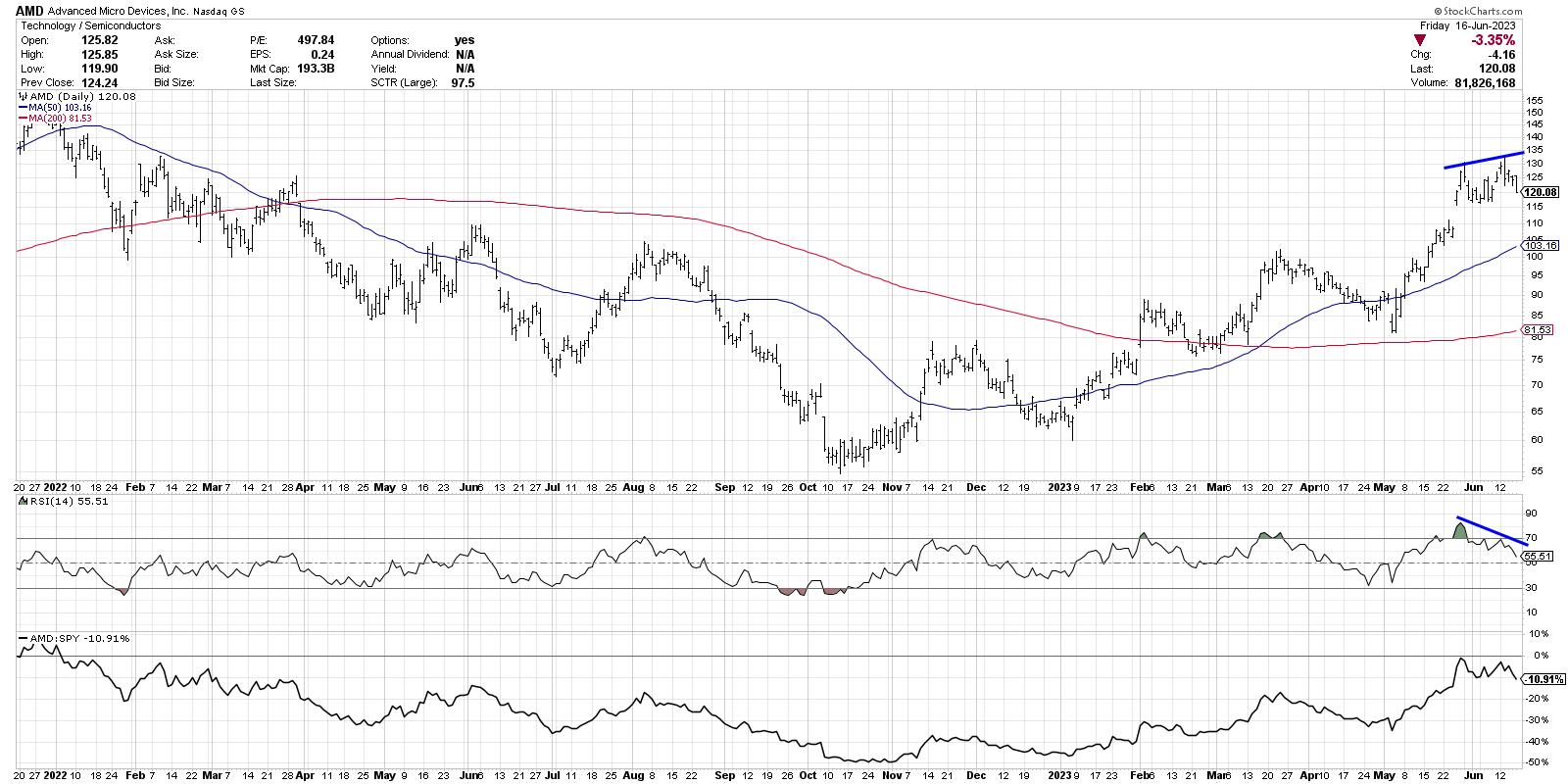
This week, AMD was one of the first leadership stocks to flash a bearish momentum divergence. Again, this indicates a possible exhaustion to the bullish phase, as the uptrend is basically “running out of gas” with buyers no longer pushing the price higher.
Stocks like Nvidia (NVDA) are also showing a potential bearish momentum divergence, but many other names like Apple (AAPL) keep pushing higher on stronger momentum. Look for the strongest charts to struggle. There’s your signal that this uptrend in technology is abating.
For now, the Technology sector appears strong. But we are now showing patterns similar to previous market tops. And that tells me to remain diligent and be prepared to take risk off the table!
RR#6,
Dave
P.S. Ready to upgrade your investment process? Check out my free behavioral investing course!
David Keller, CMT
Chief Market Strategist
StockCharts.com
Disclaimer: This blog is for educational purposes only and should not be construed as financial advice. The ideas and strategies should never be used without first assessing your own personal and financial situation, or without consulting a financial professional.
The author does not have a position in mentioned securities at the time of publication. Any opinions expressed herein are solely those of the author and do not in any way represent the views or opinions of any other person or entity.