
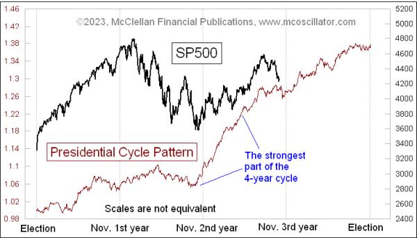
We are just about to wrap up the 3rd year of the current presidential term, and head into the 4th year, also known as election year. For the purposes of tabulating these years, I start them at the beginning of November instead of January, because the presidential and mid-term elections occur at the beginning of November, and their effect is felt immediately on the stock market rather than after inauguration.
The 3rd year has a long history of being an up year nearly every time. We have to go back to 1939, when the Wehrmacht was marching through Poland, to find an instance when that “rule” did not work. But even with the strong history of being an up year, the autumn of the 3rd year often sees stock prices stumble, or at least chop sideways. The current pullback in stock prices fits that model pretty nicely.
Soon we will be in the 4th year, the election year, which is also an up year on average, although not nearly as strongly. And there is a lot more variability about whether election years are up years. 2008, for example, was a fairly ugly year for the stock market. 2000 was not much fun either, after the Internet Bubble collapse.
Before we get to the bullish portion starting upward again, the Presidential Cycle Pattern (PCP) in this week’s chart says we still have a bit more sideways chopping to get through. But readers and chart analysts should not assume that the stock market will follow this pattern precisely, especially in October, because of one particular anomaly in the data.
October 1987 was in the 3rd year of President Reagan’s second term. That month saw an historic crash, when selling pressure overwhelmed the ability of the trading floor to handle orders, and of the quote system to provide accurate updates of what was happening. The quote system that fed the pricing on all of the new computerized quote systems was running as much as 90 minutes late. Because traders and investors did not know what was happening, many entered blind sell orders, adding further to the selloff.
That selloff still shows up in the data, even when we average together multiple prior 4-year terms to create the PCP. Here is a zoomed in chart:
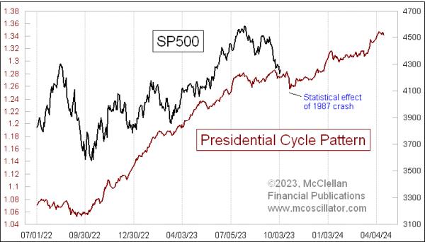
The effects of the Oct. 19, 1987 crash serve to pull down the average, and depict a lower low in the PCP. This does not necessarily mean that prices will do that this time. After all, this is an average pattern, and roughly half of the prior periods were better than this, half worse.
It is worth noting that in this current presidential term, the bullish portion of the 3rd year was a lot less robust than what the PCP shows. It was still up, though, so that particular message of the PCP worked great. But with the Fed hiking rates and pulling back all of the QE that was thrown at the banking system due to COVID, and hiking short-term rates, it is understandable that the magnitude of the market’s 3rd year performance has not quite been the same as other 4-year periods.
This does not take away at all from the usefulness of the PCP. It is, after all, just a depiction of what “average” is. When we use it, we should all understand that there will be variations from it. It is still a useful guide even with that limitation. And just ahead, it says that there should be a big swoop up in Q4 of 2023.